
I had worked with Andrea before — years before she became a client. She was the project manager of a community initiative I had volunteered for, and somewhere in those conversations she had mentioned wanting to document her work properly. All the projects, the impact, the stories. She felt they deserved to be recorded.
When she reached out about the Flow Society website, I already understood what she was building and why it mattered. A lot of things were validated during the inception meeting — their challenge was clarity. Potential partners and clients were coming to the website and leaving without understanding what Flow Society actually did. Too much text, too little direction, and a services section that raised more questions than it answered.
Website Audit
The first thing I did was go through the existing website carefully. A few things stood out immediately.
The services section was vague — it listed "Ongoing Project Opportunities" which was actually a summary of past projects they had no plans to continue. A potential partner reading that would have no idea what Flow Society actually offered.
Previous Services Section

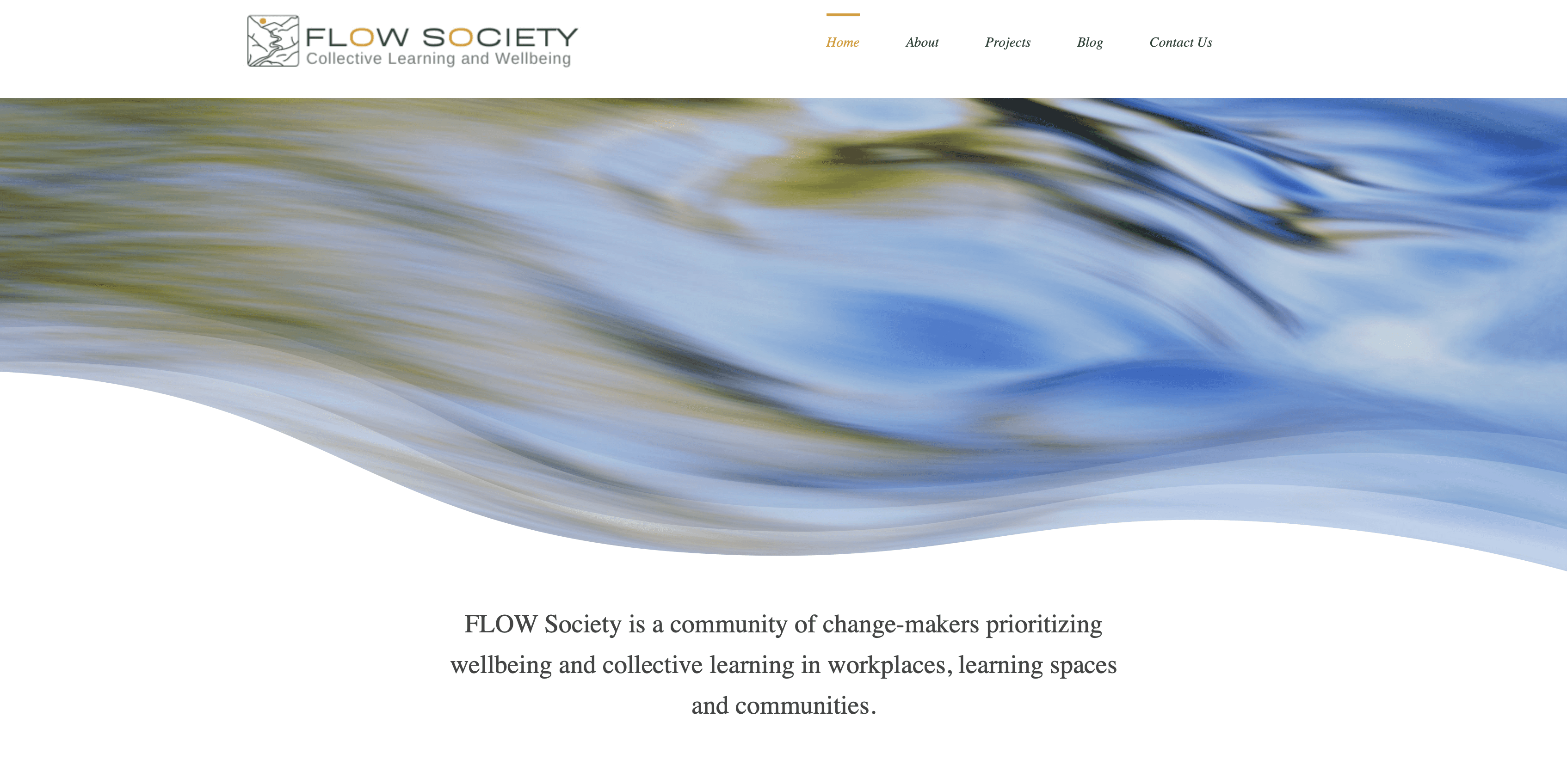
The hero section had a strong tagline but used an abstract design instead of real photography. For an organisation built on human connection and community, that felt like a missed opportunity. Most of the other images on the site were stock photos which made it feel generic.
Previous Hero Section
And the whole website was heavy on text. The work Andrea and Diana had done over the years was significant — but you could not feel that from reading the site.
The Design Process
The ideation phase was the most exciting part of this project. I had several meetings with Andrea and Diana , they called it a therapy session. We would brainstorm, challenge assumptions, and slowly work through what they actually wanted to say and how they wanted to say it.
Defining the Services
The first thing we tackled was the services. After hours of conversations and weeks of sitting on it, we finally had a clear, confident set of offerings that actually reflected what Flow Society did. That alone was a significant milestone.
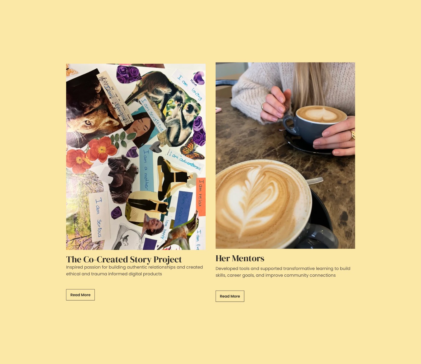
Showcasing Past Work
Flow Society had done a lot of impactful work but had no structured way to show it. Since Andrea and Diana both have an academic background, I suggested calling their past projects case studies. They loved it. I designed a template they could use for every project they wanted to highlight going forward.
Impact and Testimonials
Most organizations put impact numbers on their website. Andrea and Diana were not keen on that approach, they wanted something more understated. So instead we wove micro testimonials throughout the website. Small, human, specific moments of impact rather than a row of statistics.
Sketches
After a few reiteration rounds, we finalized the sketches which clearly captured the soul of Flow Society.

Final Design
The updated design is clean and purposeful — similar in tone to what Andrea and Diana had before, but with the clarity and structure their audience needed.
The homepage gives you everything at a glance — their services, their values, their partners, and through the photography, a real sense of the work they have done. You land on it and you understand immediately what Flow Society is about.
I also designed a separate About Us page to give first-time visitors a deeper look at their values. And the language around the team section was carefully crafted — because for Flow Society, everything is about partnership, not hierarchy.
Before handing over the project, I recorded a video tutorial so Andrea and Diana could update the case studies themselves as new projects came in. That was important to me — the website had to work for them long after our project ended.


Reflection
This project was different from anything else in my portfolio. I was not just designing for a client — I was designing for someone whose work I genuinely believed in. That made the stakes feel higher, and the process feel more meaningful.
The biggest lesson was about communication. Understanding what a client wants is only half the job. The other half is offering your own perspective — pushing back when something is not working, suggesting ideas they had not considered, and making the process feel like a real collaboration. Andrea and Diana were generous partners in that way. They trusted me enough to let the conversations go deep.
The case studies feature was my favourite part. It started as a sketch idea and became something they still use today. That is the kind of outcome that matters more to me than any visual.
If I were to do anything differently, I would push harder for consistency across all the pages from the start — that is something I noted for next time.

