Introduction
An informative user journey to help new donors clearly understand the organization’s impact in order to drive individual donations.
Project Overview
On week 4 of the bootcamp, I was placed in a four person team on a 5-day design sprint to evaluate the usability of a non profit or a charitable organization’s landing page and donation experience. My team selected the non-profit organization called Connect Vancouver.
Team Tornado
Sidra Mobin, Jimmy Kao, Alison Cowling, Brian Qi
Duration
Five days
Project Type
Academic design sprint for UX Diploma at BrainStation
Role
UX Researcher and Writer
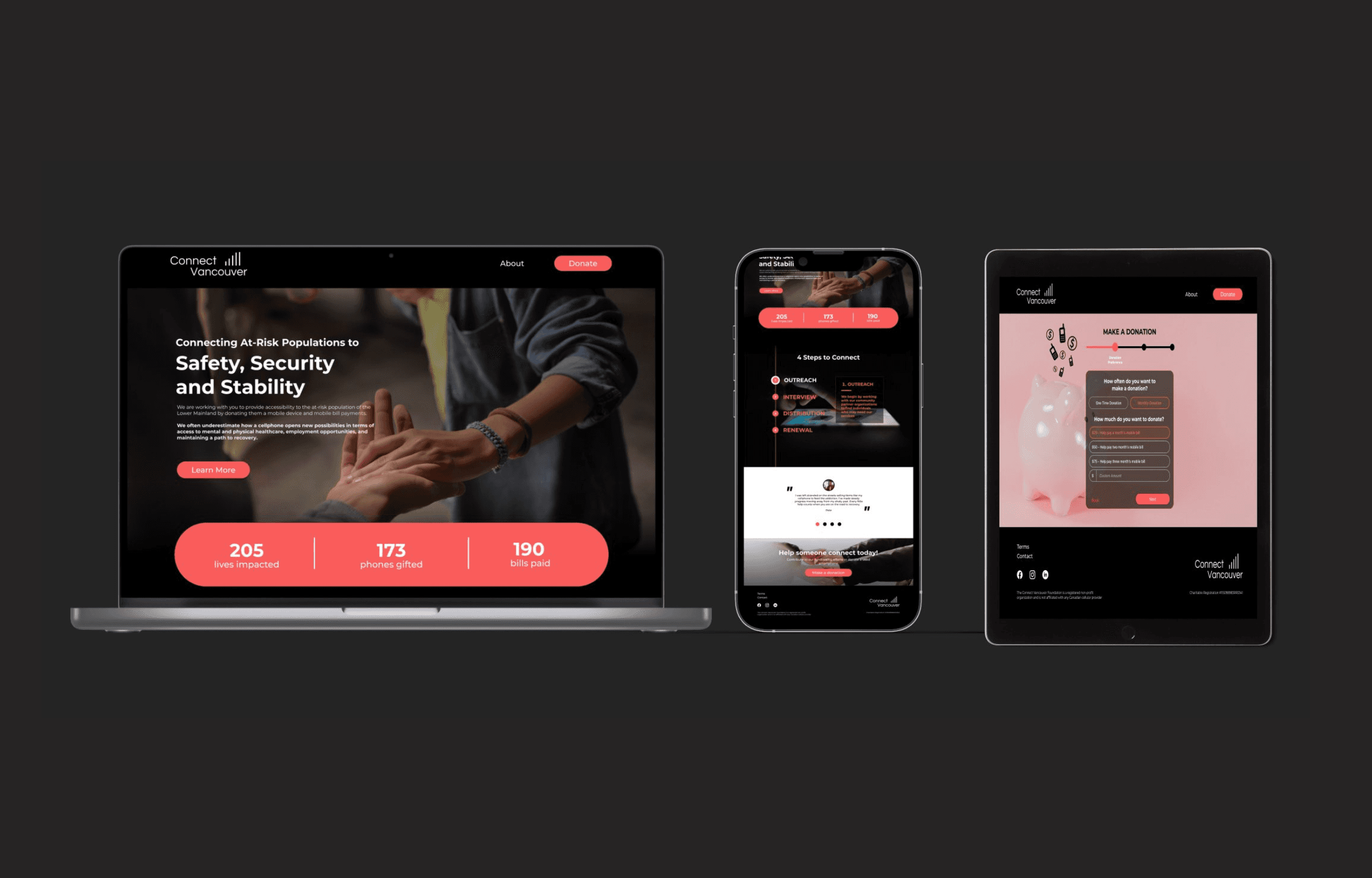
Original Website
Walkthrough
Why Connect Vancouver?
We spent four days brainstorming, researching, prototyping and evaluating different ways to figure out the problem space. The first step was to select the charity of our choice. We selected Connect Vancouver, a local charity which provides smartphones and smartphone bill support to Vancouver's homeless and at-risk community. We were immediately drawn to this organization because of the unique and practical approach of helping at risk population.
Problem Space
DIGITAL DIVIDE AND AT-RISK POPULATION
In this day and age, there are billions of people who remain without the universal human right of internet access, cell service, and consequently access to essential services (e.g. crisis line, calling 9-1-1, etc.) - truly a digital divide. To address this situation, ConnectVancouver came into being in 2018. ConnectVancouver is a registered non-profit organization bridging the digital divide by providing free smartphones, bill support, and digital literacy training to the homeless and at-risk community in Canada.
As a first step, we reached out to Neor Tiku, the cofounder and director of ConnectVancouver, to discuss the challenges their organization faces in addressing the Digital Divide.
Our conversation with Neor illuminated 3 key challenges:
Digital Marketing is Resource Intensive: Organic growth feels like a non-starter
Misunderstood Tech Utility: Cellphones aren’t seen as an immediate need
The Waitlist is Growing: Their organization is seeing a growing waitlist demonstrating urgency and the need to bring in more funds and devices to connect Vancouver's most vulnerable
Goal
Through discovering these key problems for the organization, we devised a goal to create an informative user journey to help new donors clearly understand the organization’s impact in order to drive individual donations.
Process
We were provided with a suggested process and daily goals by BrainStation, which the team used as a guide.

Secondary Research


Website Audit
Before we dived in, we conducted a thorough website audit. We noticed that the impact of Connect Vancouver’s work was not being translated on the website. As a result, it was not able to evoke emotions to the extent that the donors would feel motivated to donate.
Furthermore, while there was abundance of information on the website, it required a proper organization to effectively communicate their service and success stories. Additionally, we observed that the donation process can benefit from being simpler and rewarding. So we instantly got started!
Primary Research
During our interview with Neor, the founder, we discovered that their organization recognized a knowledge gap between generations. As a result, they target individuals aged 20-40 for donations, as this group is more familiar with mobile and digital technology. Based on this insights, we devised to focus our target demographic audience on people age 20-40, versed in cellphone and digital technology.
We interviewed eight individuals and through affinity mapping, we uncovered the following themes and insights.


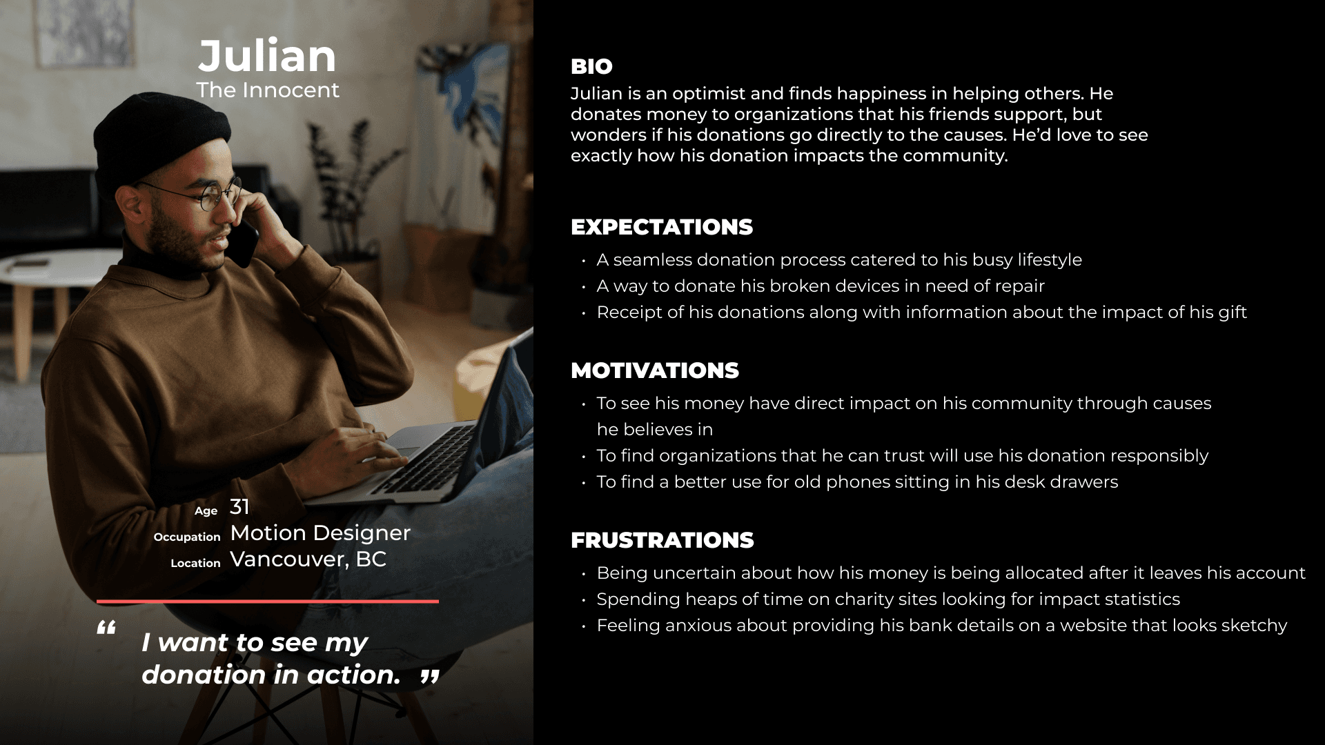
Persona
Through our primary research, we were able to create our user persona, Julian. He is a 31 years old, motion designer and lives in Vancouver. He expects a seamless donation process catered to his busy lifestyle.
How Might We…
The research findings and Julian led us to the big question:
“HOW MIGHT WE COMMUNICATE THE TANGIBLE IMPACT OF DONATIONS TO NEW DONORS IN ORDER TO INCITE A FEELING OF ACCOMPLISHMENT AND ENCOURAGE DONOR RETENTION?”
Competitor Analysis
Before diving into the sketches, we wanted to synthesize existing ideas to create an informed solution. We examined products and solution in different domains and it gave us a very interesting perspective on how different organizations were solving problems. This exercise also became the source of UI Inspiration.
During our competitor research, we discovered that while there were multiple British Columbia based non-profit organizations working with at-risk population, almost none of it was working in the digital divide domain. There were around six organizations which were using cellular services to cater a target audience, but not at risk-population.
We conducted a quick audit of those organizations on basis of transparency and inspiring content, and placed ConnectVancouver somewhere midway in both being transparent and inspiring. The audit helped us to see that we needed to work on the website copy to be inspiring.
Sketches
We did a quick and fun exercise of crazy 8s, voted the sketches and then moved on to the solution sketches.


Content Strategy and Branding
KEYWORDS: SIMPLE, CLEAR AND IMPACTFUL
When developing the content strategy, we focused on clear and impactful communication of the message without overwhelming the users. Furthermore, we had noticed that the website contained all the information needed for a user to make an informed decision to donate; however, it was text heavy and somewhat unorganized.
The first thing we did was simplify the 'what' and 'how' of the services. Since the idea is unique and during our research we discovered that users did not realize the importance of the cell phones for at-risk population, we wanted to ensure that the hero text explained the concept quickly. We also introduced micro testimonials throughout the website to evoke emotion and add credibility to the cause and the organization.
However, the overall theme was kept consistent with the original brand colors. The red and black fit the brand.
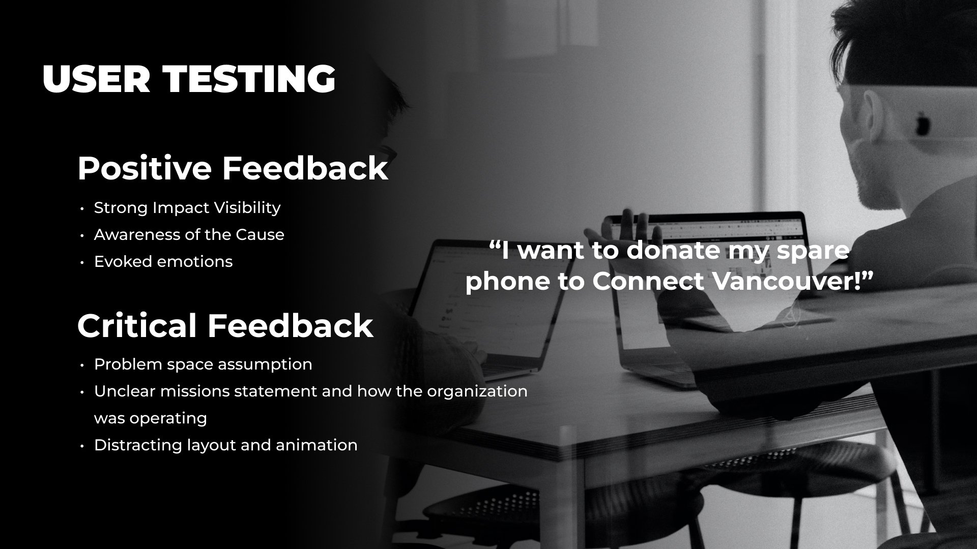
Usability Testing
Of course, our initial prototype was not without its flaws. We assumed that our users could understand the urgency of having a smartphone, but this was not always the case. Some users still viewed a smart phone as a nicety instead of a necessity. Combined with prototype level of fidelity, user’s understanding of the core concepts and the mission became non optimal.
Before

Originally, the information was organized within text drawers that opened up on cursor hover. The hover interaction model was finicky and prone to accidental triggering.

Users commented that fundraiser tracker on the donation page was thoughtful but also pointed out this could be problematic for returning donors as they have to scroll to the bottom to get to the donation links.

Phone donation is a big appeal to the target audience of Connect Vancouver. The original webpage has an intimidating wall of text that explained the donation process.
There were some visual style inconsistencies on donation pages.
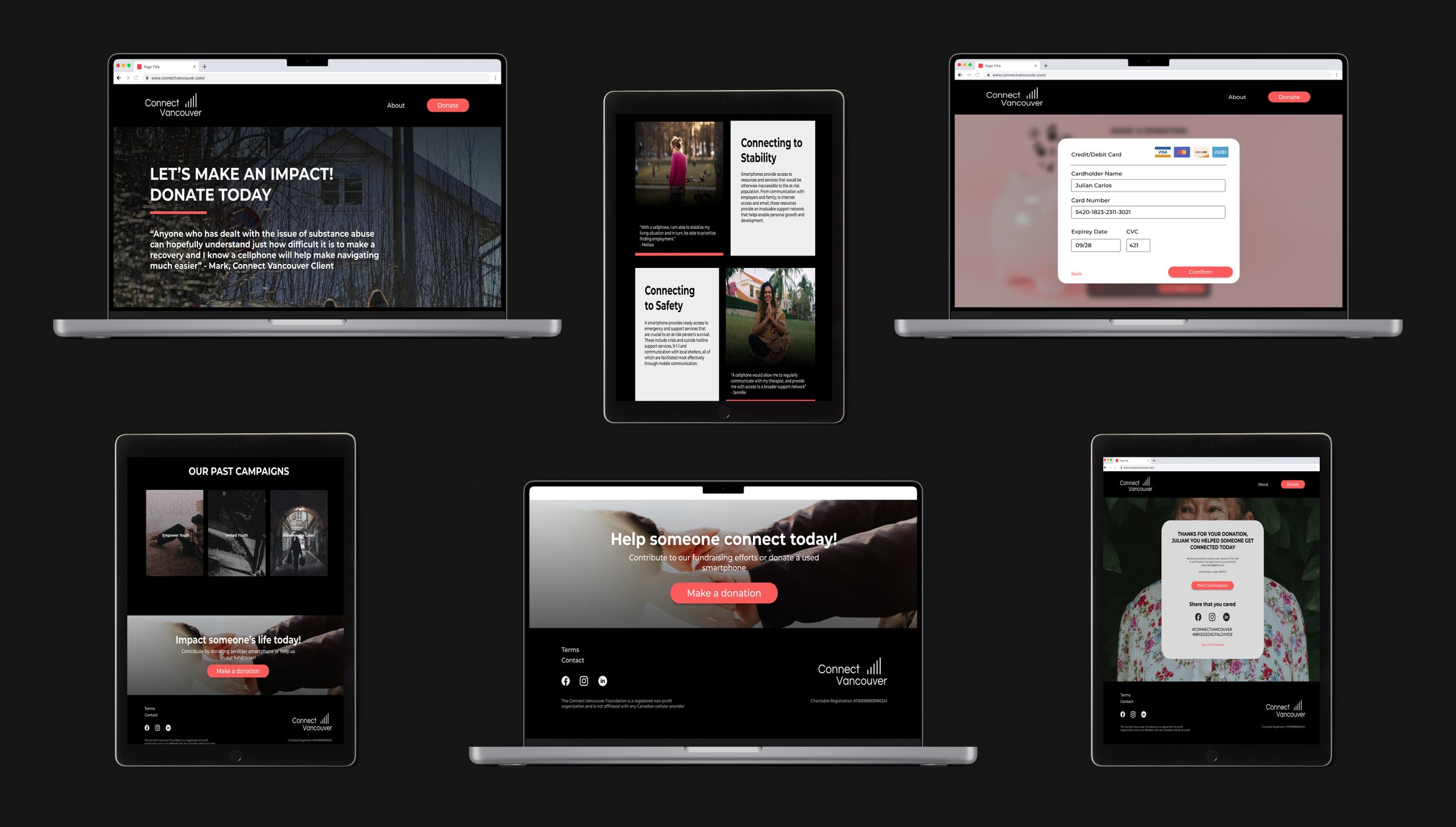
After

The new design click-through overlay interaction model lets users make conscious decision to activate what they wanted to see.

We corrected the hierarchy on donation page and placed the links up higher in the stack, above the fundraiser tracker.

We redesigned phone donation page with a step-by-step walkthrough with pictures that explained the process. This made it less daunting and we further revised interaction to be more intuitive for human engagement.
We fixed the inconsistencies on the donation process pages.
The Big Reveal
After 5 days of intense design sprint, we were ready to reveal the masterpiece!
What did the experts say?
…and then arrived the big day, the final presentation. Overall, the concept and the redesign was well received by the panel. One of the panelist called the design a piece of art! Some of the notable comments were:
“Prototype is consistent, realistic, with nice integration of interactions to enhance fidelity.”
“We would love to see more about the individuals you're helping outside of the testimonials, as that point resonated with me in the research but wasn't as prominent in the solution."
What's next?
We had a limited time at hand for our sprint, and big dreams. As we finalized and presented the design, we already knew the next steps for the website, which were also validated by the feedback on the final presentation.
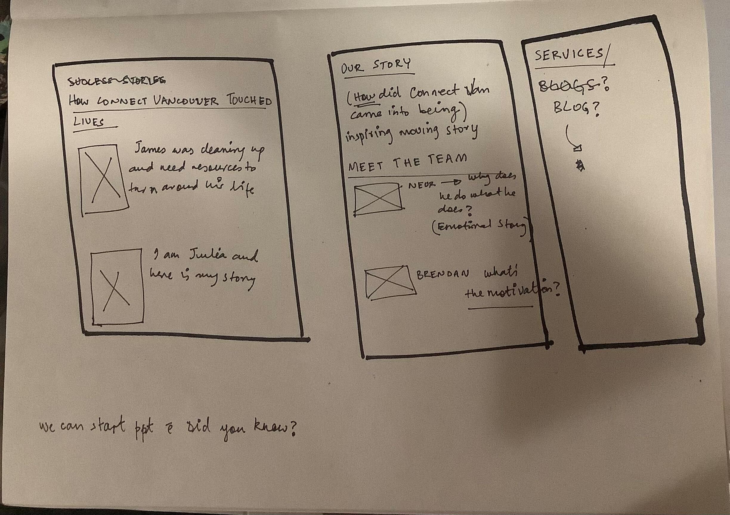
“Team” Page
Users want to know who is behind the action: Can they be trusted? What is their background? What motivated them to start this nonprofit organization? Naturally, the next step is to share the team’s stories to build credibility and show the people managing this important project.
Success Stories
One of the feedback we received during the presentation was to showcase the success stories outside the testimonial. In our redesign, while we took care to highlight the impact with the testimonials and the statistics, we would like to add the full stories of the clients building on the content of the original website.
Key Learnings
Value of Communication
One of the reasons our project was such a hit was because the teamwork was evident in our work. We knew that we had little time to pull this off so we ensured constant communication with each other. We built a great rapport and did not hesitate to voice our opinion, even the unpopular ones. The result was a great design!
Learn to step back and see the big picture
At 1 am, sleep deprived, when we found ourselves stuck on small design decisions, we reminded ourselves to take a pause and think about how this decision is going to impact the overall message which our design is trying to communicate. It worked like a charm!
Ask better questions
Specially during testing!