
Five years ago, Celeshmet Restaurant opened its doors in Vancouver. Since then, Behavar, the co-founder, had wanted a website for a more professional brand presence. However, this project was repeatedly delayed until she met me at a party and learned that I had recently graduated from BrainStation as a UX Designer.
I was delighted when she asked me for help! Not only was I getting a chance to put an independent, non-academic project on my portfolio, it also happened to be my favourite Persian eatery in Vancouver.
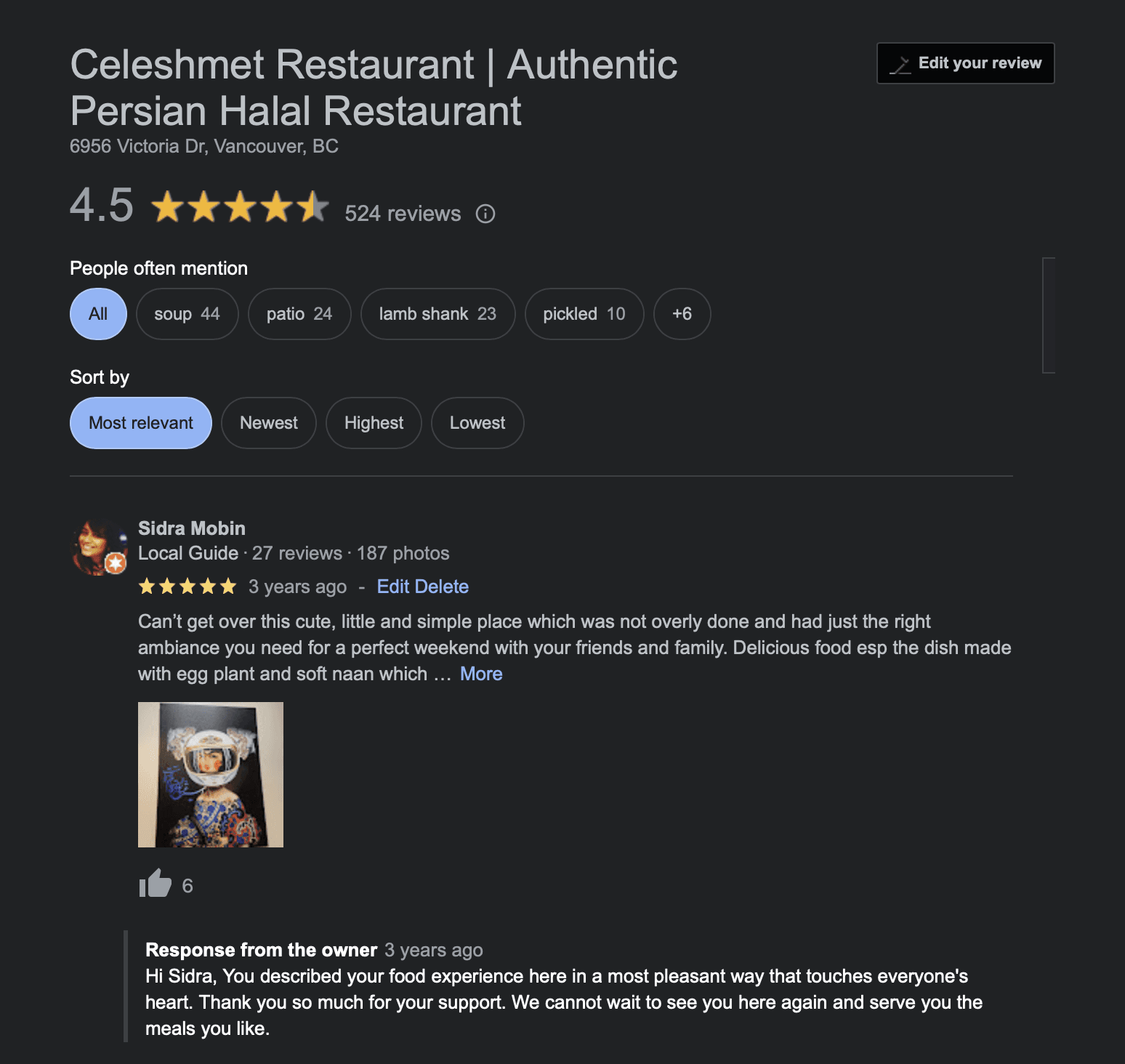
Fun fact: my Google review for Celeshmet is still the top-viewed one on their page.
Problem Discovery
I asked Behavar why she wanted a website. She said — because every restaurant has one.
As a new designer, that seemed like a totally valid reason. But with the help of my mentor, I pushed a little further. What problems was she actually hoping to solve?
It turned out that even with descriptions on the menu, her diverse clientele often struggled to picture the food. She wanted a digital space where she could show the dishes properly. And in four years, Celeshmet had collected a quiet pile of recognitions — certificates, news articles, badges from the culinary world. She wanted a digital shelf to display all of it.
Research
Behavar had some inspirations, so I started there. Looking through the websites she liked, I noticed a pattern — most of them had a clean, simple look. That became the visual direction.
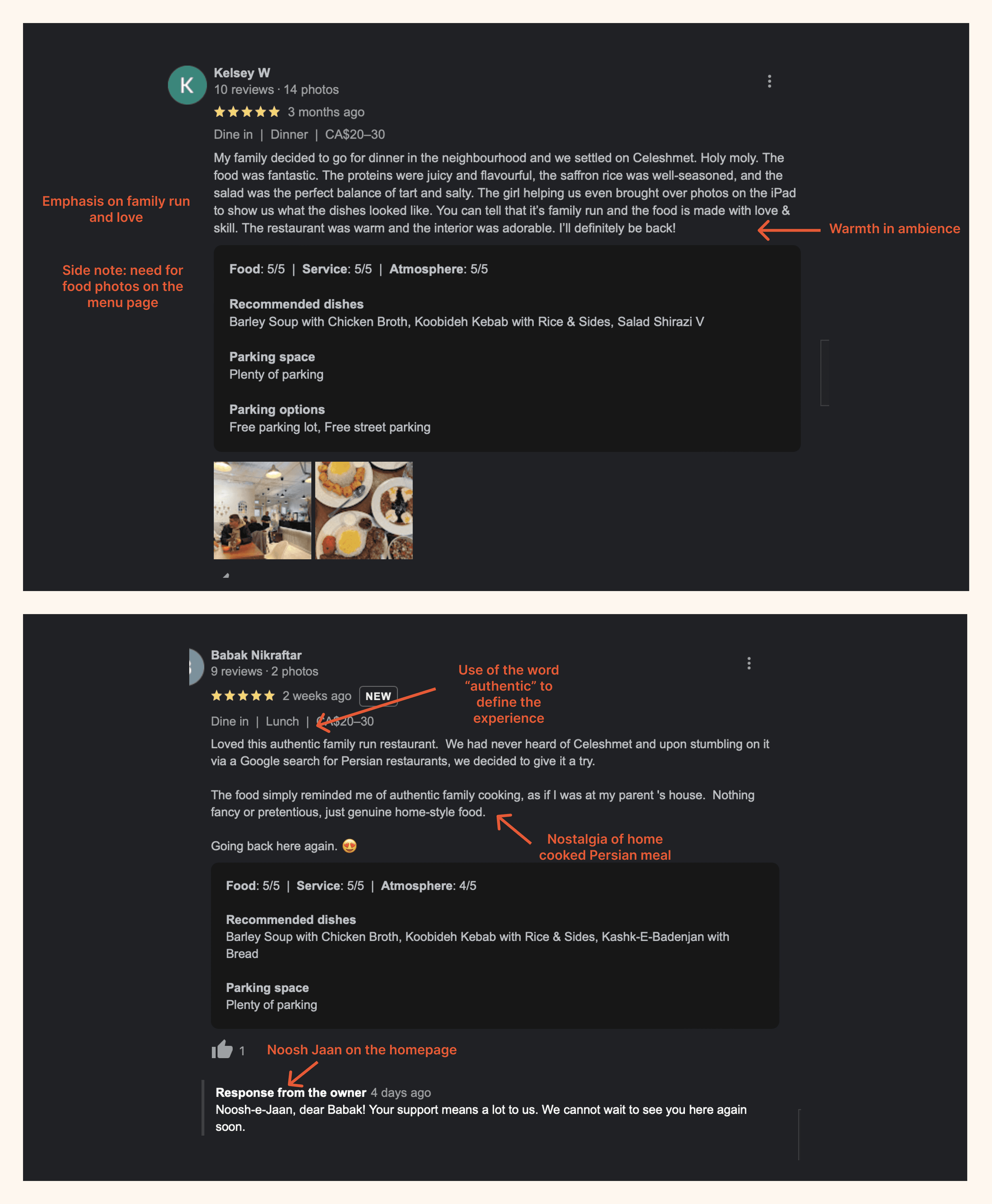
For primary research, I spoke to six people from diverse cultural backgrounds who liked trying new restaurants in Metro Vancouver.
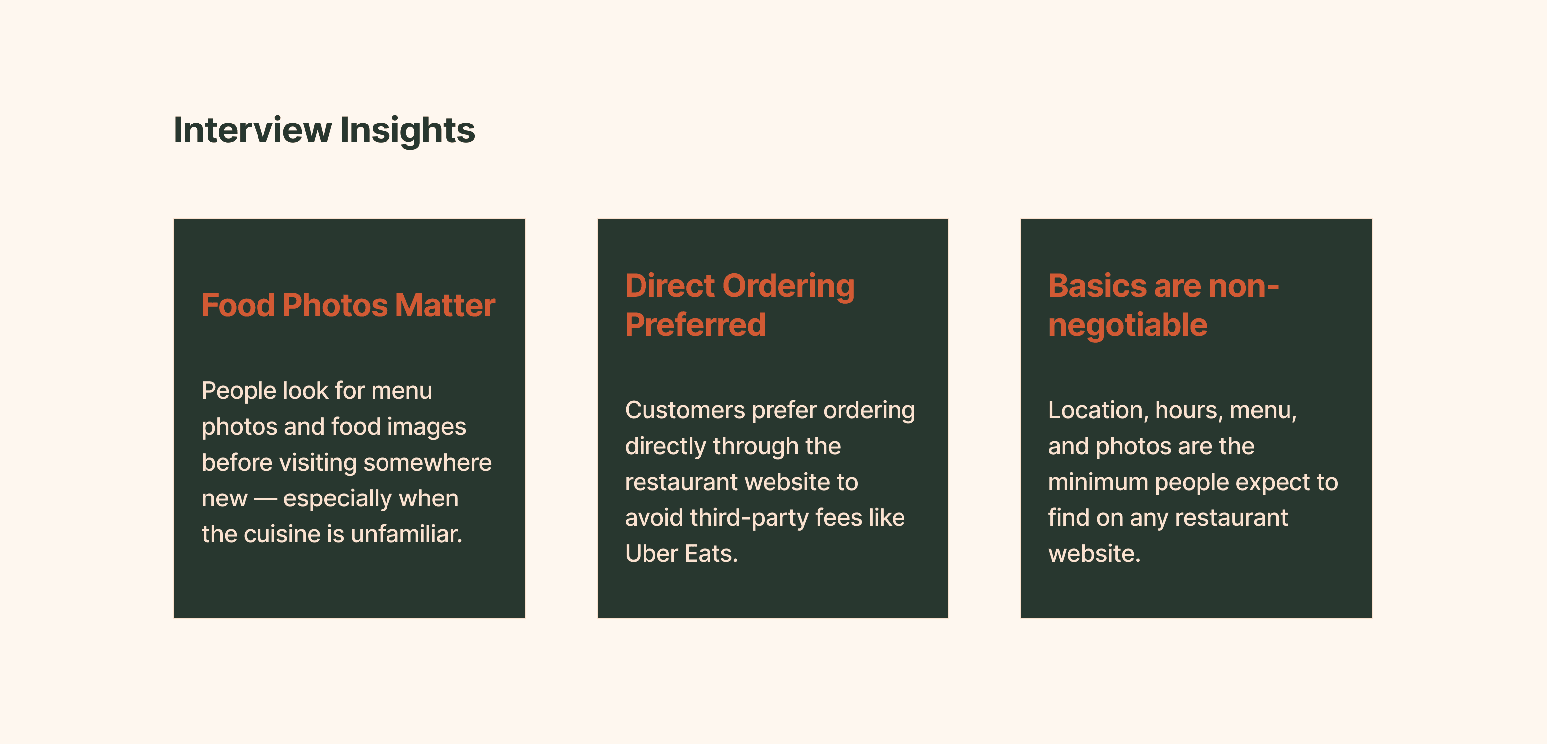
A few things came up consistently. People looked for menu information and food photos before visiting somewhere new — especially when the cuisine was unfamiliar. Some used the restaurant website directly for pickup orders to avoid third-party fees. And for most people, the basics — location, hours, menu, photos — were the minimum they expected.
That confirmed what Behavar already knew. The website needed to make the food feel real before anyone walked through the door.
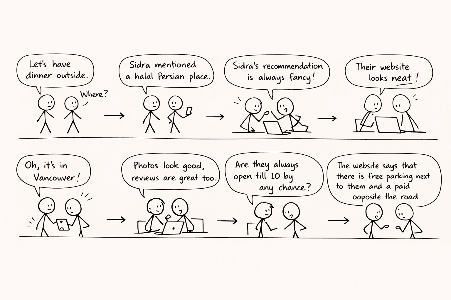
Storyboard
Before sketching anything, I mapped out a simple scenario, two friends want to check out a restaurant they have heard about. They look it up, check the menu, find the location. Basic, but it was enough to anchor the design decisions that came after.
Design Process
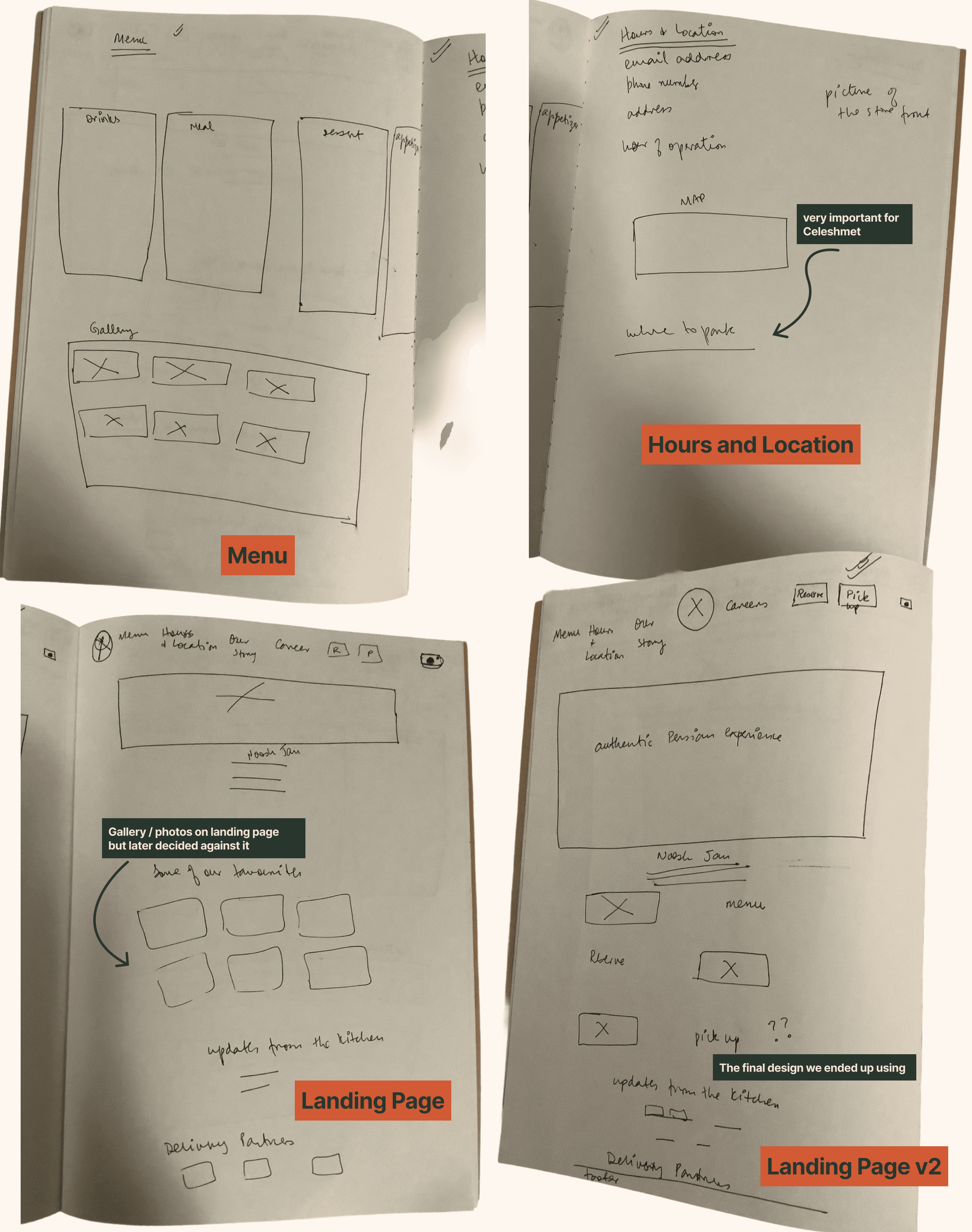
Sketches
wanted to focus more on the landing page and the menu, based on Behavar's request and interview insights.
One thing that I had to decide was to bring the food photo gallery on the front page or on the menu page. I scribbled some sketches and after discussing with Behavar, we thought it was a good idea to put the gallery on the menu page since the QR code which she is going to use in the restaurant will direct to the menu page of the website.
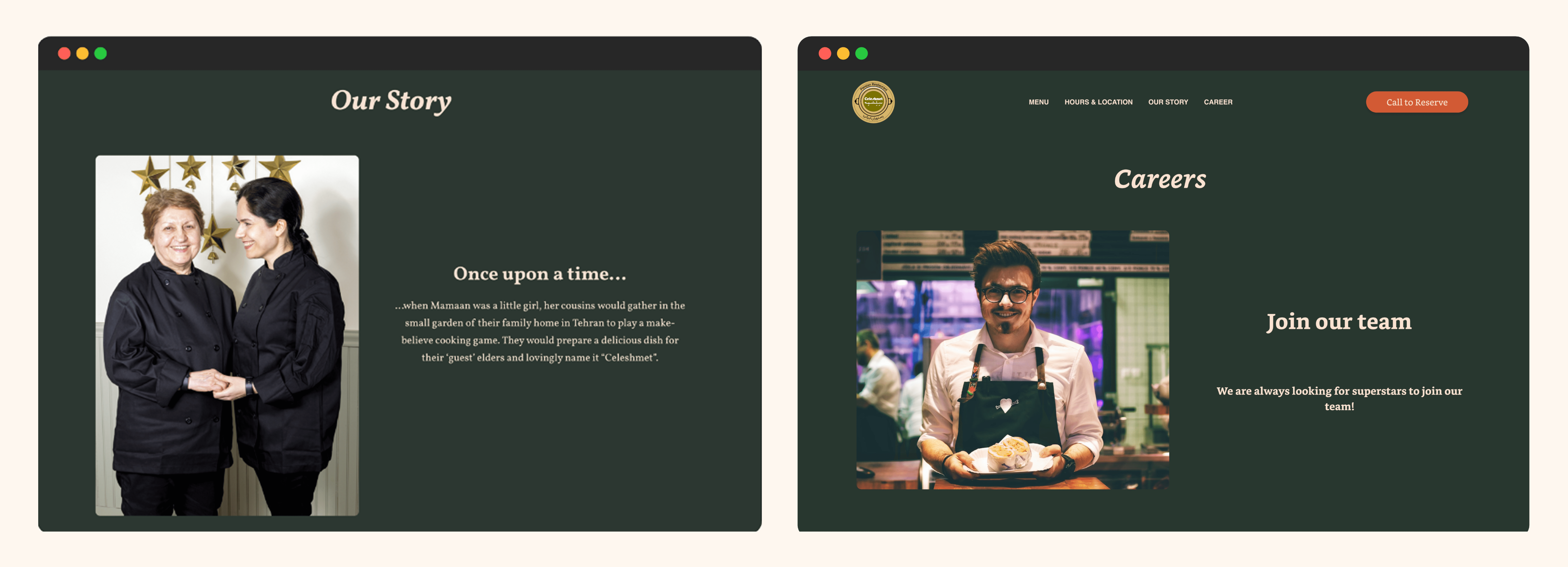
During the inspiration phase, I learnt that I needed to keep the other three pages, hours and location, our story and careers, consistent in design. Although as we went along the design process, our story page kind of designed itself!
A Customer-Centred Approach
The idea of the content came from the reviews that Celeshmet has received on different platforms. While Celeshmet is a hidden gem, it has a loyal customer base not only in South Vancouver but also in the USA. Customers often used terms like "warmth of home, streets of Tehran, hospitality, authentic Persian experience." It was not hard to see that Celeshmet was not just a cuisine, it was an experience. This is exactly what I wanted to capture on the website. Other than the functionality of the website, the overall feel had to be matched by the vibe of the restaurant.
The language used on the website was inviting. The entire website was from Behavar's perspective. I specially enjoyed writing the Our Story page, where Behavar shares the story of how her mother came up with the name Celeshmet — and why it is so important for them to make their guests feel like family.
Moodboard
I asked Behavar how she would define the Celeshmet experience. Not to my surprise, the answers mirrored exactly what customers had been saying in their reviews.
The keywords that came up: warm, welcoming, friendly, authentic, home, kind, family.

While the sketches did not take multiple rounds to get approved, colour was another story entirely.
I am not going to pretend I nailed it on the first try — or the second, or the third. One after another, the landing page came back looking wrong. Too loud, too muted, too generic. But after several iterations, I landed on a palette that finally felt like Celeshmet.
Navigating Squarespace
This was my first real experience implementing a design on a live website — and I was not prepared for the gap between what Figma allows and what Squarespace allows.
Most of the website translated fine. But the menu page was a different story. I had designed it exactly the way I wanted — separate tabs for each course, photos that changed with each tab, dietary icons neatly stacked in a row. It looked clean, organized, and exactly right.
Then I started building it.
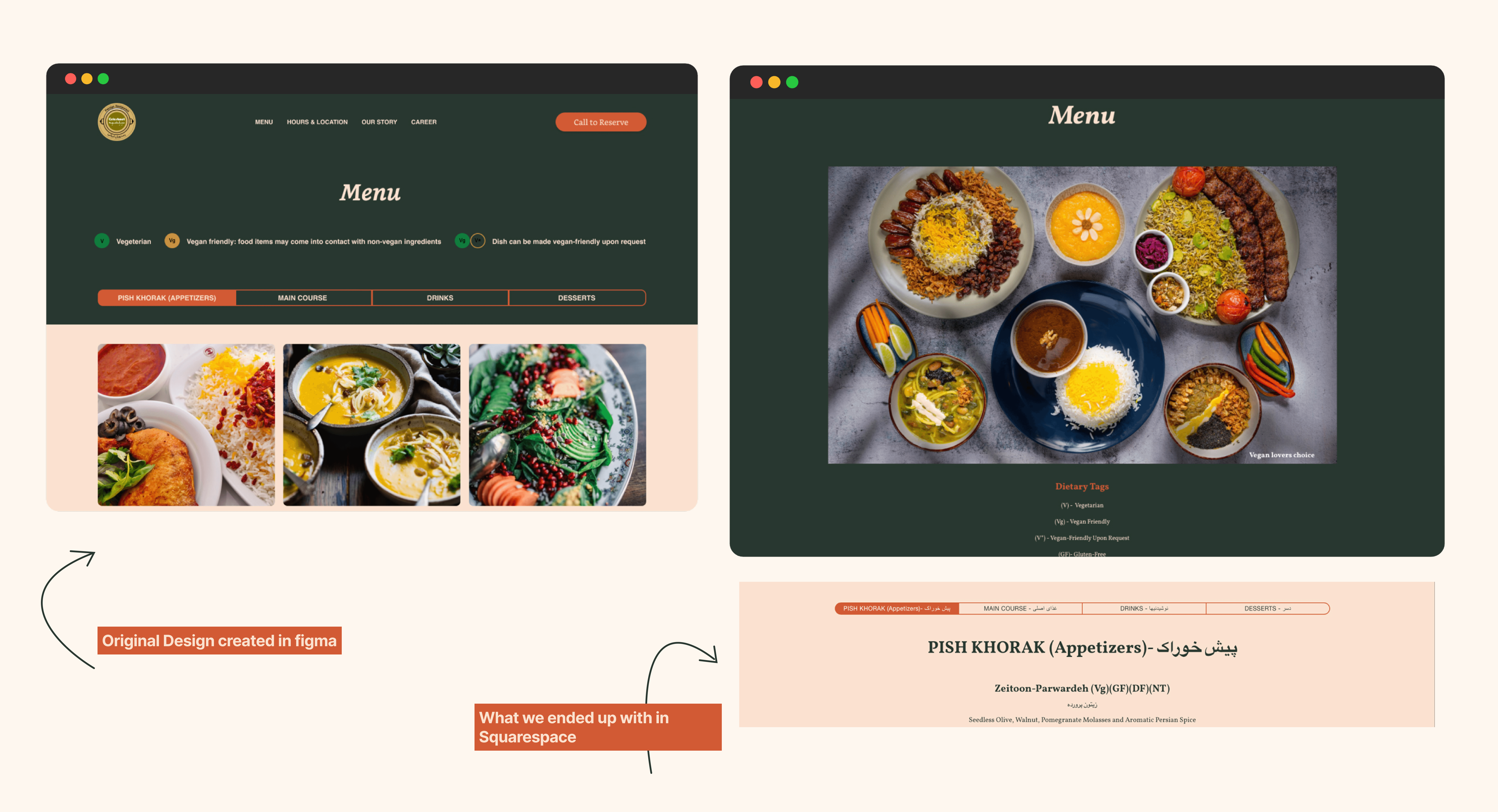
Squarespace has its own fixed structure for menus. The tabs were not possible without custom code, which I researched and figured out. The gallery could not sit inside the menu, so I replaced it with a strong hero image and a consolidated photo gallery at the end. The dietary icons had to become letters — V, VG — because Squarespace does not support custom icons.
It was not what I originally designed. But I made it work within the constraints — and the client loved the result.
Final Design
After all the iterations — the colours, the constraints, the workarounds — here is what Celeshmet looked like when it was done.
Reflection
This project taught me more than I expected — and not just about design.
What I learned
I had no idea how subconsciously we make decisions when it comes to something as simple as selecting a restaurant. The primary research had the most aha moments for me — from delivery options to understanding why anyone would visit a website when everything is available on Google. User interviews proved to be extremely insightful.
I also learned that professional photos are just as important as the design itself. The beautiful photography elevated everything. A website is only as good as the content it holds.
Challenges
Hands down the biggest challenge was selecting a colour palette that was not only aesthetically pleasing but truly represented the brand. After several — and I mean several — iterations, I finally got there.
The Squarespace limitations were humbling too. It was my first real experience of implementing a design on a live platform and I was not prepared for the gap between what Figma allows and what a website builder allows. But it pushed me to problem-solve in ways I had not done before.

